Elevating Online Presence: Designing A Purposeful Website for AAOZ
My mission was to empower the Alpha Alpha Omicron Zeta chapter of Zeta Phi Beta Sorority, Incorporated with a dynamic web presence that fosters seamless communication, collaboration, and information sharing.
As a designer, I aim to provide a user-friendly platform that not only addresses the chapter’s immediate need for a central hub but also reflects their values of unity, sisterhood, and community engagement.
Through thoughtful design and functionality, I strived to elevate AAOZ’s online presence, enhancing their ability to connect, inform, and inspire their members and community.
Design Thinking
Creating a Seamless User Experience
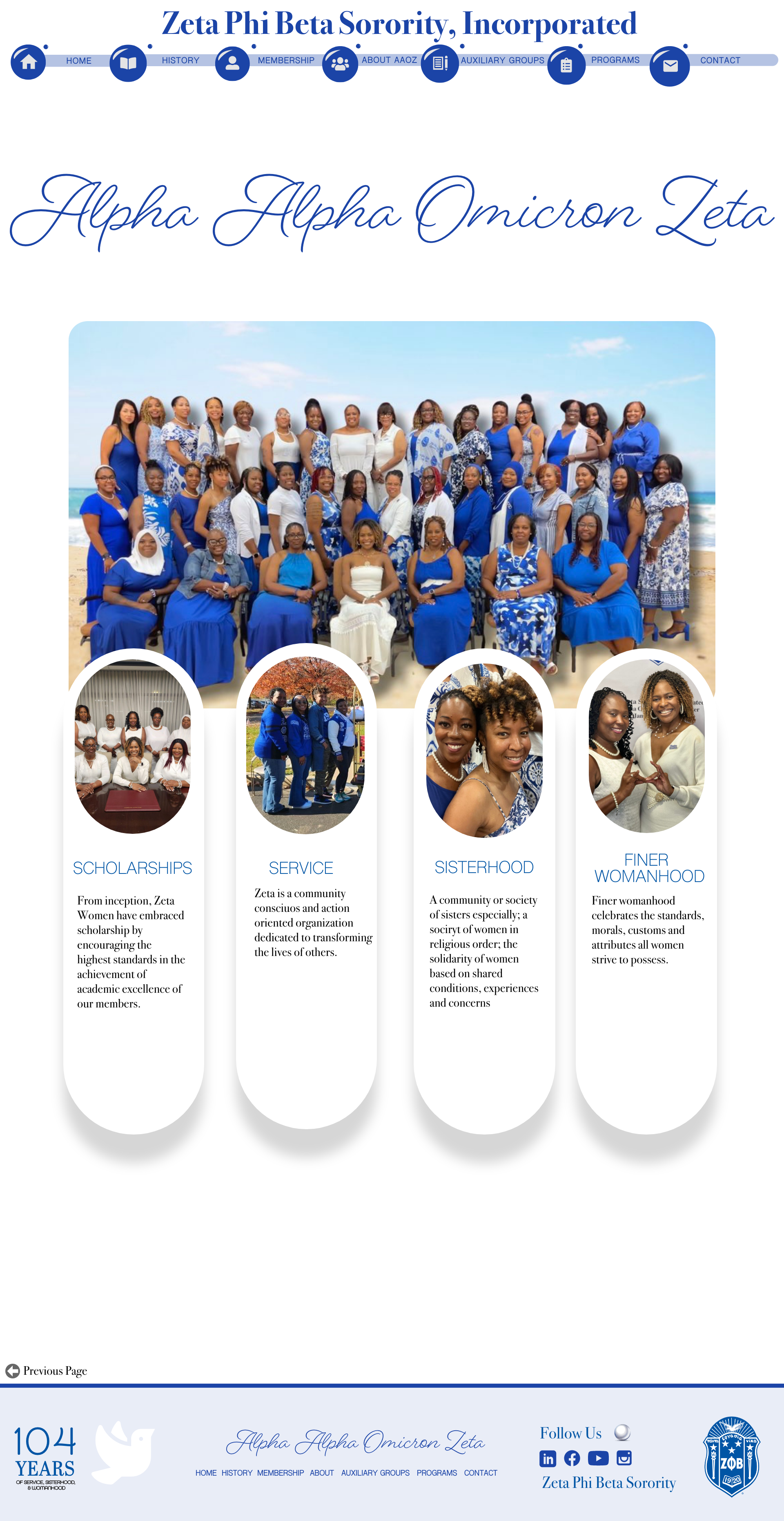
In developing my approach, I carefully considered the robust branding guidelines of the sorority, understanding the importance of maintaining consistency while infusing the website with its own distinct personality. My goal was to create a digital space that not only reflected the overarching brand identity but also exuded its own unique charm. By adhering to the traditional royal blue and white color palette, I honored the sorority's heritage while injecting modern elements that resonate with today's audience.
Digital Journey
Crafting a Distinctive Brand Identity: The Art of Authentic Expression
I embraced a harmonious blend of organic and geometric shapes throughout the design, symbolizing the balance between tradition and innovation within the sorority's values. This fusion not only adds visual interest but also conveys the dual qualities of gentleness and empowerment that define the sorority experience. Each element was thoughtfully curated to evoke a sense of inclusivity and belonging, ensuring that every visitor to the website feels welcomed and valued. At the forefront of my design strategy was the creation of an inviting landing page that serves as a gateway to the sorority's digital world. By incorporating clear homage to the sorority's rich history and values, I aimed to instill a sense of pride and connection among members while also piquing the interest of potential recruits. The landing page serves as a dynamic introduction to the sorority's mission, accomplishments, and community, setting the stage for deeper engagement and exploration throughout the website.
Brand Identity
Empowering Members: The Need for a Chapter Website for AAOZ
The AAOZ chapter of Zeta Phi Beta Sorority, Incorporated, as part of a larger national organization faces a significant challenge. Unlike many of its counterparts, the AAOZ chapter lacks a dedicated website, resulting in fragmented communication and limited access to crucial resources for its members. This absence of a central online platform hampers the sorority's ability to facilitate seamless interaction among its members and impedes the dissemination of essential information and updates. Therefore, there is an urgent need to establish a comprehensive website tailored to the unique needs and preferences of the AAOZ chapter, fostering a cohesive digital experience that empowers members to navigate effortlessly and find precisely what they are looking for.

Web Navigation
Showcasing Seamless Navigation
In developing my approach, I carefully considered the robust branding guidelines of the sorority, understanding the importance of maintaining consistency while infusing the website with its own distinct personality. My goal was to create a digital space that not only reflected the overarching brand identity but also exuded its own unique charm. By adhering to the traditional royal blue and white color palette, I honored the sorority's heritage while injecting modern elements that resonate with today's audience.
Problem Solving
Unified Web Design: Harmonizing Elements for Cohesive Experience
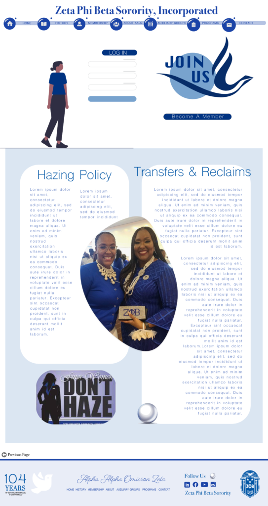
My Role as a Product Designer: In my capacity as a product designer, I undertook the task of understanding the specific content requirements of AAOZ members for their website. Through comprehensive research and collaboration, I crafted a mock-up that encapsulates the desired features and functionalities. This mock-up serves as a detailed blueprint, outlining the structure, layout, and interactive elements of the future website. With a clear roadmap in hand, my next step involves translating this mock-up into a fully functional website. Leveraging the user-friendly platform of Squarespace, bringing the envisioned design to life and ensuring a seamless online experience for AAOZ members and visitors alike."
Mobile Innovation: Designing an app That Inspires and encourage Engagement
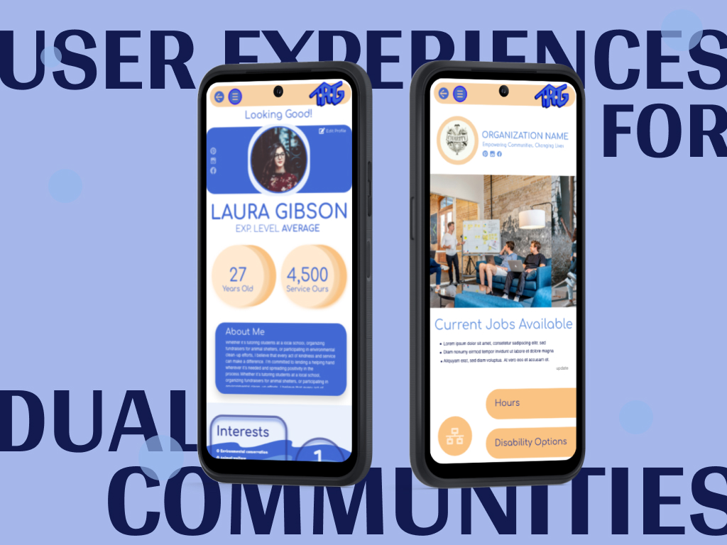
My mission is to create an app that serves as a bridge between volunteers and nonprofit organizations, facilitating meaningful connections within communities while fostering personal growth and social impact. I believe that doing good not only benefits others but also enriches our own lives, promoting a sense of fulfillment and purpose.
I envision this app as a platform for individuals to expand their social circles, forge new friendships, and cultivate a sense of belonging. By bringing together like-minded people who share a passion for community service, we can create a supportive network that encourages collaboration, empathy, and understanding.
Through this app, I aim to empower individuals to find volunteer opportunities tailored to their interests and skills, enabling them to make a tangible difference in their communities. By connecting volunteers with nonprofit organizations in need of dedicated support, we can collectively contribute to the betterment of society and create positive change.
User Profiles
Crafting a Resilient App Design
In my approach to this design, I prioritized creating seamless experiences for both volunteers and nonprofit organizations, ensuring smooth interactions between the two groups. Regardless of their affiliation, users should find it effortless to connect with each other and access the information they need. To distinguish between the two sides, I implemented distinct color schemes while ensuring a cohesive overall design language. With a focus on boldness and a hint of playfulness, the design aims to engage users and foster a sense of enjoyment while navigating the platform. Additionally, I incorporated features that allow users to customize their preferences, giving them greater control over their experience. Ultimately, the design encourages users to contribute to the community while seamlessly navigating the platform, ensuring that both volunteers and nonprofit organizations can easily fulfill their respective roles.
Sign Up/ Log In
Crafting a Distinctive Brand Identity: The Art of Authentic Expression
I embraced a harmonious blend of organic and geometric shapes throughout the design, symbolizing the balance between tradition and innovation within the sorority's values. This fusion not only adds visual interest but also conveys the
Overlays
Addressing Challenges: Creating a Cohesive Dual App Design
To ensure a positive and inclusive experience for all users, I had to address a multitude of possibilities within the app design. The interface prioritizes readability by presenting text prominently. Seamless navigation is key for user ease. The app should offer a comprehensive info source on nonprofits and provide clear options for users to explore. Additionally, incorporating a feedback mechanism for users to check in after volunteering ensures accountability and satisfaction. Implementing organization ratings and anonymous reviews contributes to transparency and trustworthiness. The app must guarantee a pleasant experience for both volunteers and organizations, with all features accessible. Features catering to individuals with disabilities and language options should be prioritized. As a designer, my goal is to foster meaningful connections and engagement within the app.
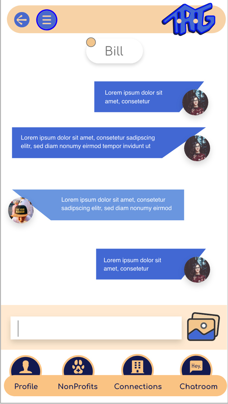
Direct Message
Facilitating Connections
My Role as a Product Designer: As a product designer, my goal is to give communities meaningful opportunities to dedicate their time and skills to becoming a volunteer. I am enthusiastic about the prospect of individuals making a positive impact and who are eager to assist wherever needed. Volunteering not only provides our communities with a sense of fulfillment, but also aids in personal growth and healing journey. I aimed to imbue the app with a sense of personality and warmth. Through this volunteering application, I aim to expand horizons with my designs and help individuals forge new friendships, and contribute to the betterment of their community. I believe in the power of doing good and its positive impact on both individuals and society. Additionally, volunteering fulfills requirements for schools and universities, and aligns with the values of those who encourage engagement and active community service. Using bold colors and positive language I presents an opportunity to diversify user experiences.
App Icons
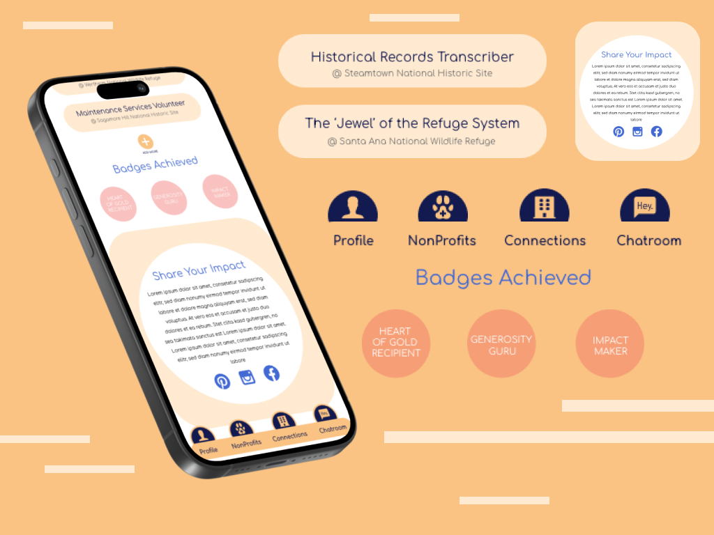
Crafting App Icons: Designing Visual Identity for Digital Experiences
In designing app icons, careful consideration of color harmony is essential to ensure a visually appealing and cohesive aesthetic. By selecting colors that complement each other, we create a harmonious palette that enhances the overall visual impact of the icons. Additionally, prioritizing legibility is crucial to guarantee that users can quickly and easily identify each icon's purpose. Simplifying icon designs and ensuring intuitive symbolism aids in making the app accessible to users of all levels of tech proficiency. Effective sizing and spacing of icons within the interface create a sense of openness and prevent visual clutter, contributing to a seamless user experience.
Settings
Simplified Settings Navigation: Enhancing User Experience
In designing the settings feature, my primary objective was to create a seamless and intuitive user experience that prioritized accessibility across all screens, including the profile pages dedicated to both volunteers and nonprofit organizations. I understood that providing users with easy access to customization options was paramount in enabling them to tailor their experience to their unique preferences and requirements. To achieve this, I meticulously crafted a comprehensive set of settings that covered all aspects of the user experience. From adjusting notification preferences to managing privacy settings and updating account details, every aspect of the user's interaction with the platform was considered. I implemented a user-friendly interface that allowed for effortless navigation and interaction with the settings, ensuring that users could easily locate and modify their preferences with minimal effort.
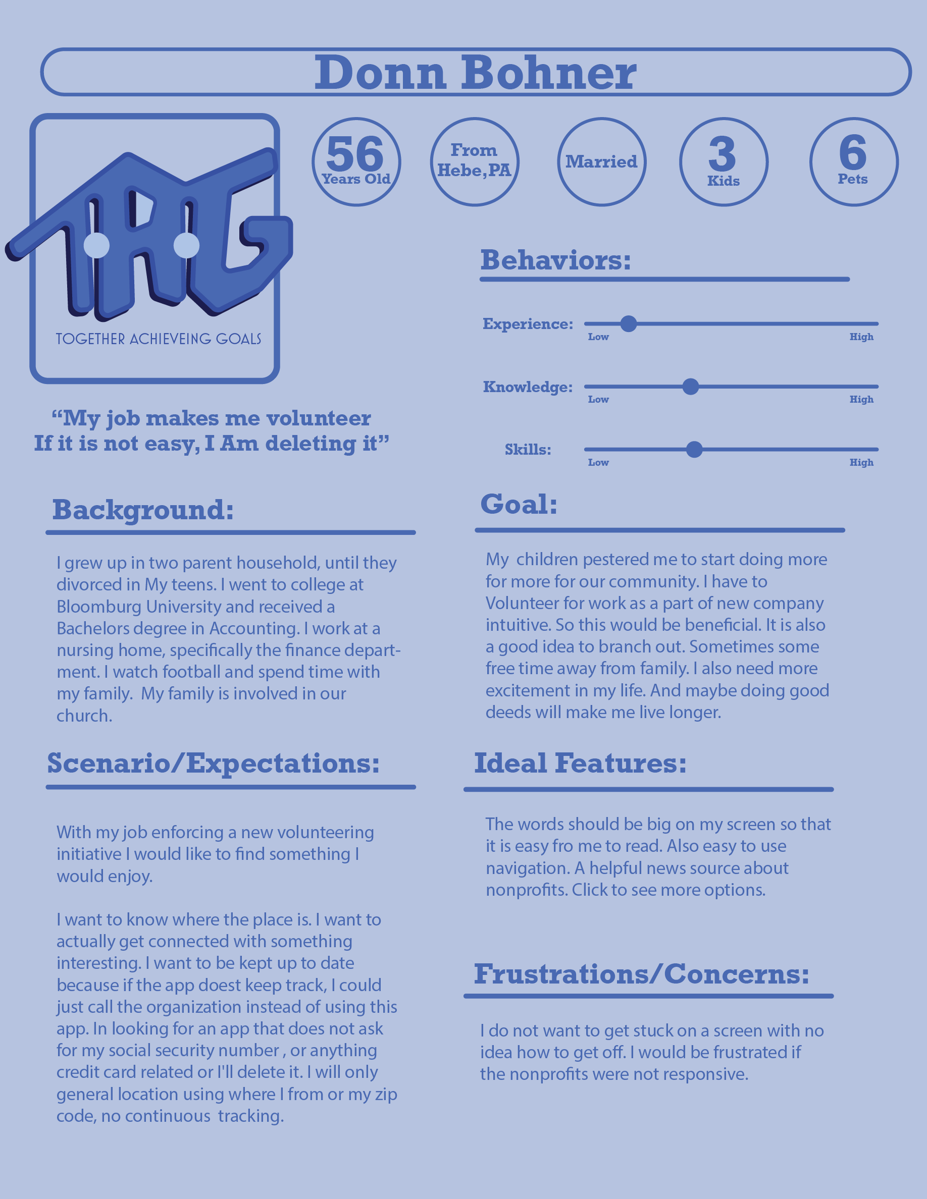
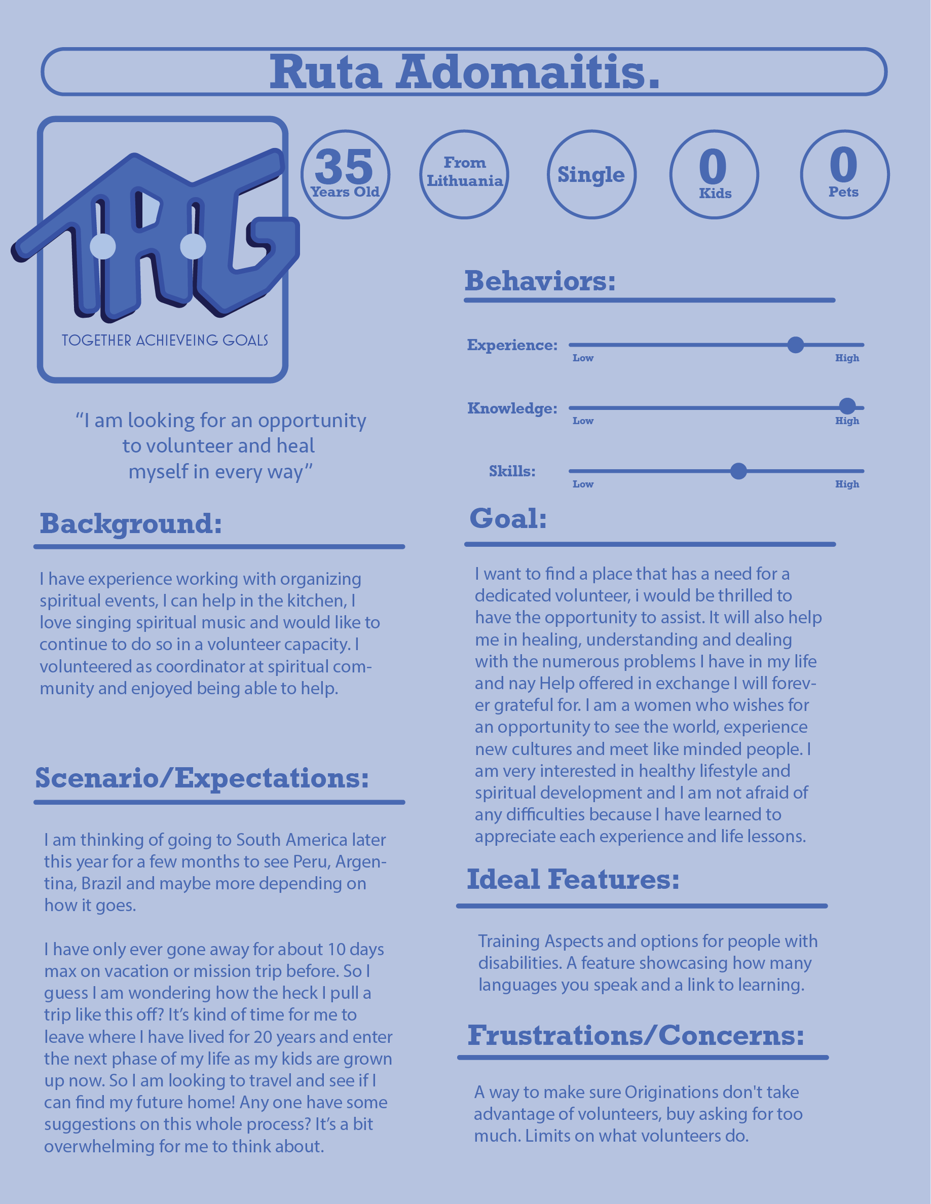
User Personas
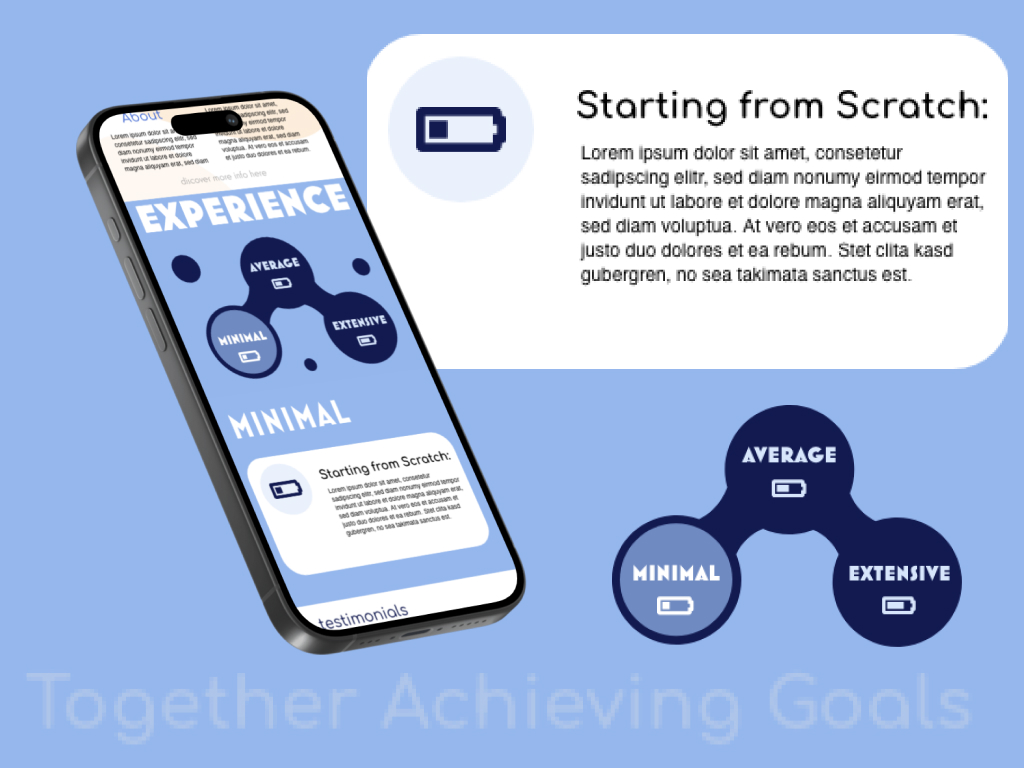
Exploring User Personas: Understanding the Audience
In order to create an app that effectively served the needs of a diverse volunteer community, I recognized the importance of gathering insights from a wide range of perspectives. To achieve this, I conducted interviews with individuals from various backgrounds and experiences in volunteering. These interviews were instrumental in uncovering the nuanced needs, preferences, and expectations of potential users, enabling me to develop comprehensive user personas that accurately represented different segments of our target audience. Armed with these insights, I embarked on the design process with a clear understanding of the user landscape. Before delving into the actual design work, I meticulously crafted a blueprint based on the wealth of information gathered from the interviews. This blueprint served as a strategic roadmap, guiding the development process and ensuring that every aspect of the app was carefully considered and aligned with the needs of its users.Every detail of the app was subjected to rigorous scrutiny and consideration, with a relentless focus on meeting the diverse needs of our users. From the layout of each screen to the wording of every button, every decision was informed by the insights gleaned from the user interviews. The ultimate goal was to create an app that truly served and empowered its users, enriching their volunteering experiences and facilitating meaningful connections within the community.
My Photography



More Projects
